You’ve poured hours into a vibrant landscape painting. Colors glow under your studio lights, and you’re thrilled with the result. But step back a few feet, and it falls flat; no depth, no drama.
That’s values sabotaging your work. Values mean the range of lights and darks in your painting. They build form, dimension, and realism, no matter the hues.
Colors fool you every time. A bright red next to green looks intense up close. Yet in black and white, weak contrasts reveal the truth; your painting lacks punch because the tones blend into mush.
Artists fix this fast with a grayscale filter. It’s a simple trick anyone can use, for free, on your phone or computer. No fancy gear needed.
This post walks you through it step by step. You’ll learn free apps like Photoshop Express or even phone camera filters, plus desktop options if you prefer. We’ll cover common pitfalls and pro tips to refine your values on the spot.
You’ll master this in minutes and transform flat paintings into standouts. Colors will serve your values, not hide them.
But first, grasp why values trump color every time.
Grasp Values to Make Your Art Come Alive
Values drive the power in your paintings. They cover the full range from pure black to pure white. This scale creates form, depth, and mood, separate from any color you pick.
Picture a plain ball sketched on paper. Dark shadows on one side make it look round and real. Light highlights on the other add that pop. Values do all the heavy lifting there.
Strong value contrasts grab attention fast. They guide the viewer’s eye and build excitement. Weak contrasts, however, flatten everything. Your art feels boring, even with vivid hues.
Most painters rely on a simple 9-step value scale. Step 1 hits pure black. Step 2 darkens to near-black. Grays build through steps 3 to 7. Step 8 lightens to near-white. Step 9 shines as pure white. Practice squinting at real objects to match tones accurately.
Rembrandt owned this skill. His works glow with bold lights against inky shadows. Viewers feel the drama because values lead the way.
Beginners trip up here often. They fall for bright colors right away. Excitement blinds them to tone issues. So, their pieces thrill up close but flop from across the room. Colors distract. Values reveal the real story.
You fix this by checking tones first. Grasp values, and your art springs to life.
Spot the Difference: Value vs. Color Confusion
Bright colors play tricks on your eyes. Take two vivid reds side by side. Up close, they look distinct because of hue shifts. Step back, though, and tiny tone differences vanish. Your painting loses punch.
Grayscale cuts through the noise. It strips color away and lets values scream the truth. What seemed lively turns muddy. Darks blend into lights. Form disappears.
Try this quick test yourself. Squint at your canvas. Your eyes average tones naturally. Does the scene hold shape? Or does it smear into gray soup?
Many artists learn this the hard way. Impressionist Pierre-Auguste Renoir chased color early on. His works dazzled in sunlight. Critics noted flatness, however. He adjusted by strengthening values. Result? Timeless depth.
Colors tempt you to skip value checks. They dazzle in the studio. Distance exposes flaws. Grayscale filters solve that fast. Use them, and watch weak spots jump out. Your art gains real strength.
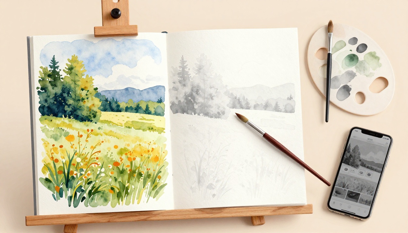
Unlock the Grayscale Filter Magic for Any Setup
Grayscale filters work simple magic. They strip away all color from your painting. What stays behind are pure tones of light and dark. Think of it like a black-and-white photo of your art. Suddenly, values stand clear. No more color tricks hiding weak spots.
You get instant feedback this way. Point the filter at wet paint or dry canvas. It reveals issues right away. Shadows too light? Highlights too dull? The filter shows truth fast. Plus, anyone can do this. No special skills required. Beginners grab it first because results come quick.
This tool fits every artist. Oil painters check canvases mid-session. Digital creators test layers on screen. Watercolor folks spot muddiness before it sets. Even sketchers refine drawings. Accessibility shines here. Free options abound. Pro setups optional. You pick what matches your space.
Benefits stack up high. First, it saves time. Spot problems early and fix them. Second, it builds better habits. Train your eye to see tones over hues. Third, it boosts confidence. Your paintings gain depth that lasts. Viewers notice strong values from across the room.
Now, choose your method. Start with your phone for speed. Switch to desktop for control. Go analog if tech skips out. Each path delivers clear views. Free hacks lead. Paid tools follow. All serve the same goal: strong values every time.
Pick one below. Test it today. Watch your art transform.
Phone Hack: Camera App in a Snap
Grab your phone. It’s the fastest way to check values. No apps to download. Just use the built-in camera.
Open the camera app. Point it at your painting. Hold steady about two feet away. Now swipe for filters. On iPhone, tap Effects. Find Mono or Grayscale. Android users hit Modes. Select Noir or similar black-and-white option.
Zoom in close. Check small areas like shadows under leaves. Pull back out. See the big picture. Compare to real shadows on your canvas. Do they match? Tones too close blend together. Darken weak spots right away.
Pros make this a winner. It’s free. Super portable for plein air work. Always ready in your pocket.
Cons exist, though. Screen glare hits in bright light. Reflections muddy the view.
Fix that easy. Dim room lights first. Add a matte screen protector. It cuts shine. Take screenshots too. Save before and after shots. Review later without the phone.
Here’s how in steps:
- Launch camera.
- Aim at art.
- Swipe to grayscale.
- Adjust zoom.
- Note fixes needed.
Test on a landscape next time. You’ll spot flat skies fast. Values pop clear. Your phone turns hero.
Desktop Power: Photoshop or Free Alternatives
Work digital art? Or scan traditional pieces first. Desktop tools give sharp control.
Fire up Photoshop. Open your file. Go to Image, then Adjustments. Pick Desaturate for quick strip. Or choose Black & White for sliders. Tweak each color channel. Reds turn deep shadow? Boost them.
GIMP matches free. Load image. Right-click, Colors, Desaturate. Or hit Black & White. Same power, no cost.
Scanned your oil painting? Flatbed works best. 300 DPI keeps details crisp. Avoid phone scans; they blur tones.
Next, adjust levels. Image, Adjustments, Levels. Drag sliders. Punch up contrast. Darkest blacks hit bottom. Bright whites top out. Midtones balance now.
Free online pick? Photopea runs in browser. Photoshop clone, zero download. Save originals first. File, Save As. Keep color version safe.
Compare side by side. Toggle filter on off. Weak values jump out.
Steps to nail it:
- Scan or import art.
- Apply Desaturate/Black & White.
- Tweak levels.
- Save versions.
- Fix canvas matches.
Desktop shines for big files. Precision rules. Your values lock in strong.
Analog Trick: Print, Copy, Squint
No tech nearby? Analog methods deliver. Cheap and reliable for any studio.
Snap a photo first. Print it small, 5×7 size fits easy. Head to copy machine. Most auto-convert to grayscale. Feed print in. Out comes black-and-white version. Tones show true, no screen glare.
View the copy flat. Squint hard. Or flip upside down. Sideways works too. Your brain ignores details. Values alone fight for attention.
This beats digital for small works. Portraits or studies shine. Wet paint? Print stays dry.
Pros: low cost, no power needed. Quick for groups too.
Keep prints handy. Pin to wall. Compare often.
Try these steps:
- Print photo.
- Photocopy grayscale.
- Squint or rotate.
- Mark weak tones.
- Adjust original.
Analog keeps it simple. Values reveal themselves. Perfect backup plan.
Master the Check: Step-by-Step Value Audit That Transforms Your Work
You finished your base layer. Colors sit on the canvas, full of promise. Now apply the grayscale filter with your chosen method: phone camera, desktop app, or analog print. Tones emerge clear. Big shapes first. Do they hold strong? Next, check edges and transitions. Compare to photo references for accuracy. Finally, adjust paint. Lighten weak spots. Darken flat areas. Confidence builds fast as values lock in.
Follow these steps every time. They turn guesswork into precision. Your paintings gain depth that lasts.
- Finish the base layer. Let initial colors dry a bit. Step back. Avoid tweaks until grayscale reveals truth.
- Apply grayscale. Use phone, Photoshop, or photocopy. Hold steady. Capture the full canvas.
- Scan big shapes. Look for mass values. Sky block? Tree mass? Do darks contrast lights enough?
- Check edges and transitions. Soft blends work for skies. Hard edges suit branches. Smooth harsh jumps.
- Compare to references. Hold photo next to grayscale. Match tones side by side. Nature sets the standard.
- Adjust paint. Mix cleaner grays. Lighten with white. Darken with black or complements. Test small swatches first.
Before, your landscape showed a bright blue sky mushy against hills. Grayscale exposed it: midtone blob. After fixes, deep shadows under clouds punch against bright highlights. Form pops.
Or take a portrait. Skin tones blended dull. Filter showed lost highlights on cheeks. You added pure white edges. Cheeks glow now. Eyes draw the eye.
Repeat often. It rewires your eye.
Hunt for Value Clashes and Smooth Them Out
Muddy middles kill drama most. Grays blend everything into soup. No form shows. You spot them in grayscale as featureless zones.
Harsh jumps jar next. One tone slams into another. Shadows cut too sharp against lights. Realism vanishes.
Lost highlights fade last. Bright spots sink into grays. No sparkle remains.
Fix muddy middles first. Mix cleaner grays. Add pure black or white. Avoid weak mixes. Test on scrap canvas.
Use bigger brushes for masses. Block in large areas. Details come later. Smooth transitions blend soft.
Harsh jumps need softer edges. Feather with dry brush. Or glaze thin layers. Gradual shifts build depth.
Lost highlights demand punch. Scrape back paint. Add crisp whites. Pure titanium white works best.
Practice value thumbnails daily. Sketch scenes in 5 minutes. Grayscale them. Note clashes. Redraw fixes.
Here’s a quick checklist before calling it done:
- Big shapes contrast at least 4 steps on the scale.
- Middles stay clean, no mud.
- Edges match subject: hard or soft.
- Highlights hit step 8 or 9.
- Shadows reach step 2 or 1.
- Overall range spans full scale.
Pin this list by your easel. Run through it after every session. Problems vanish over time. Your work transforms smooth.
Pitfalls to Dodge for Spot-On Values Every Time
Grayscale filters reveal truths fast. However, bad habits sneak in and wreck results. You might spot issues but fix them wrong. Or miss them altogether. These mistakes happen because old ways die hard. Colors tempt you back. Lighting fools the eye. So, let’s fix that now.
Artists face five big traps often. Each one weakens values. But simple fixes turn them around. Spot these, and your checks pay off big. In addition, build a routine that sticks. Your paintings gain real punch.
Here are the top pitfalls, with steps to beat them:
- You rely on color alone. Grayscale shows flat tones. Yet bright hues pull your focus back. You tweak based on red’s glow, not true darks. Result? Values stay weak.
Fix it. Squint first without the canvas. Note big shapes on paper. Then mix paints to match those notes. Ignore color until tones lock in. Test swatches in grayscale too. This keeps decisions pure. - You ignore local versus global values. Local means tones within one object, like apple shadows. Global covers the whole scene. You fix the apple but let sky midtones blend into hills. Chaos follows.
Fix it. Check the full painting first. Ask if darkest dark contrasts brightest light across everything. Adjust locals last. Use a thumb-sized view to see global flow. Balance returns quick. - You over-blend everything. Soft edges everywhere smear forms. Grayscale turns your work to gray fog. No drama left.
Fix it. Pick edges by subject. Hard for branches. Soft for skies. Use separate layers or glazes. Big brushes for masses first. Details sharpen later. Contrast pops back. - Poor lighting hits your check. Studio glare or dim bulbs shift tones. Phone screen washes out shadows. Grayscale lies then.
Fix it. Use even, north-facing light. Dim overheads. Matte screens cut reflections. Check at different times of day. Nature’s light sets the real standard. - You skip thumbnails. Jump straight to canvas. No small value sketch means big errors build up. Grayscale shocks later.
Fix it. Spend five minutes on 4×6 thumbnails. Block three value masses only. Grayscale them quick. Adjust before full painting. Saves hours.
One more pro tip. View your grayscale in a mirror. It flips the image. Fresh eyes spot clashes. Your brain skips familiar flaws.
Make this a habit. Check every session. Pin a pitfalls list by your easel. Run through it after base layers. Values strengthen fast. In short, dodge these, and flat art vanishes for good.
Conclusion
Grayscale filters make value checks simple and fast. They strip away color tricks to show hidden flaws right away. As a result, your paintings gain real depth and realism.
You started with a flat landscape that thrilled up close but flopped from afar. Now strong values fix that every time. In addition, they build form and drama that lasts.
Grab your phone or app today. Test it on your next piece. Share your before-and-after results in the comments below. Subscribe for more artist hacks that save time and boost your work.
Great values turn good paintings into showstoppers. Yours will too.