Picture this. You squeeze fresh paints onto your palette, mix a vibrant sky blue with sunny yellow, and step back. Instead of a serene landscape, you get a neon explosion that hurts the eyes.
Overly bright paintings often look flat or cartoonish. They lack depth and mood. Muted tones fix that. They dull colors just enough for realistic, harmonious results. You gain subtle shadows, soft highlights, and pro-level appeal.
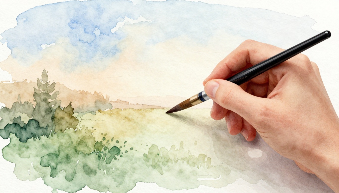
This guide shows simple steps. You’ll learn what muted tones mean, supplies to grab, mixing tricks, application tips, and practice drills. Anyone can follow along and transform their work.
What Muted Tones Really Are and Why They Beat Bright Colors
Muted tones come from colors with low saturation. They sit between bright primaries and full grays. Think of a foggy gray-blue sky instead of screaming turquoise. Or a warm beige skin tone over harsh pink.
Bright colors dominate. They clash and flatten space. In contrast, muted tones layer well. They create air, distance, and emotion. Pros rely on them for lifelike landscapes, soft portraits, and cozy still lifes.
Saturation controls intensity. Value handles light to dark. Hue is just the base color. You tweak saturation and value first for mutes. As a result, your pieces feel balanced and deep.
Start muting today. You’ll see why artists swear by this shift.
Gather These Simple Supplies to Start Muting Colors Today
You don’t need fancy gear. Pick tube grays like Payne’s or neutral gray. Add earth tones such as burnt sienna, raw umber, and yellow ochre. Grab ultramarine blue for cool mixes.
Complements help too. Try cadmium red with viridian green. Or purple with yellow. These pairs knock out vibrancy fast.
Use soft brushes for blending. A palette knife scrapes clean mixes. Test on scrap paper or white gesso board. Avoid straight-tube cadmium yellow or primaries. They fight muting efforts.
Student-grade acrylics or oils work fine on a budget. Quality matters more than bulk. Clean tools prevent mud. With these, you mix mutes without waste.
Mix Muted Magic: Step-by-Step Techniques That Work Every Time
Mix small blobs first. This saves paint. Use ratios for control. Test often. Now, break it down.
Pair Complements to Knock Out Vibrancy
Opposites on the color wheel mute each other. Add green to red for browns. Or blue to orange for slate.
Start with a 9:1 ratio. Nine parts dominant color to one part complement. For skin tones, mix alizarin crimson with a hint of green. Foliage softens with purple in yellow-green.
Equal parts turn muddy. So, go light on the complement. Blend smooth. You’ll get rich, dull hues.
Add Neutral Gray for Soft Desaturation
Make gray from black and white. Or complements like red and green. Add a pea-size gray to a quarter-size color.
For warm tones like peach, use warm gray. Cool grays suit shadows in blues. This desaturates without killing hue.
Tiny amounts shift just right. Mix, then step back. Adjust as needed.
Incorporate Earth Tones for Natural Dullness
Earth tones mute fast. Raw umber tames yellow into khaki. Burnt sienna dulls oranges for sunsets.
Blend thinly into brights. Payne’s gray cools greens for forests. Layer for organic depth.
These shortcuts feel natural. They mimic real-world dullness.
Test and Tweak on Scrap Before Your Canvas
Swatch wet and dry. Colors shift as they dry. Compare to the bright original side-by-side.
Lighten mutes with white. Deepen sparingly with black. Tweak complements if too vibrant. This habit saves your main piece.
Apply Muted Tones in Your Paintings for Pro-Level Results
Start with thin underpainting. Use muted washes for unity across the canvas. They tie everything together.
Layer darker mutes for form. Limit to five to seven colors. This keeps harmony. In landscapes, dull the sky with gray-blue. Portraits gain life from subtle skin mutes. Still lifes warm up with ochre interiors.
Spot a bright area mid-painting? Glaze a complement over it. Thin layers build dimension without mud. Your work looks polished.
Steer Clear of Mud and Practice These Drills for Mastery
Too much complement creates mud. Flat light ignores depth. Rushed mixes lack control.
Fix with clean palettes, good overhead light, and slow blends. Wipe tools between colors.
Practice these drills. First, mute a rainbow spectrum. Second, paint a grayscale still life, then layer hue. Third, copy a Rembrandt study in mutes. Do 15 minutes daily. Skills build fast.
Pull It All Together for Subtle Masterpieces
Muted tones start with understanding, simple tools, smart mixing, thoughtful layers, and steady practice. They lift any painting to pro status.
Grab your paints now. Mix one muted tone today. Share your before-and-after in the comments. What bright mistake will you fix first? Your next piece can whisper beauty instead of shouting.