Imagine painting your living room walls a sunny yellow. Suddenly, the space feels brighter and more inviting. You smile more often in there. Now picture switching to a soft blue. The room calms down right away. Colors shape our mood without us noticing.
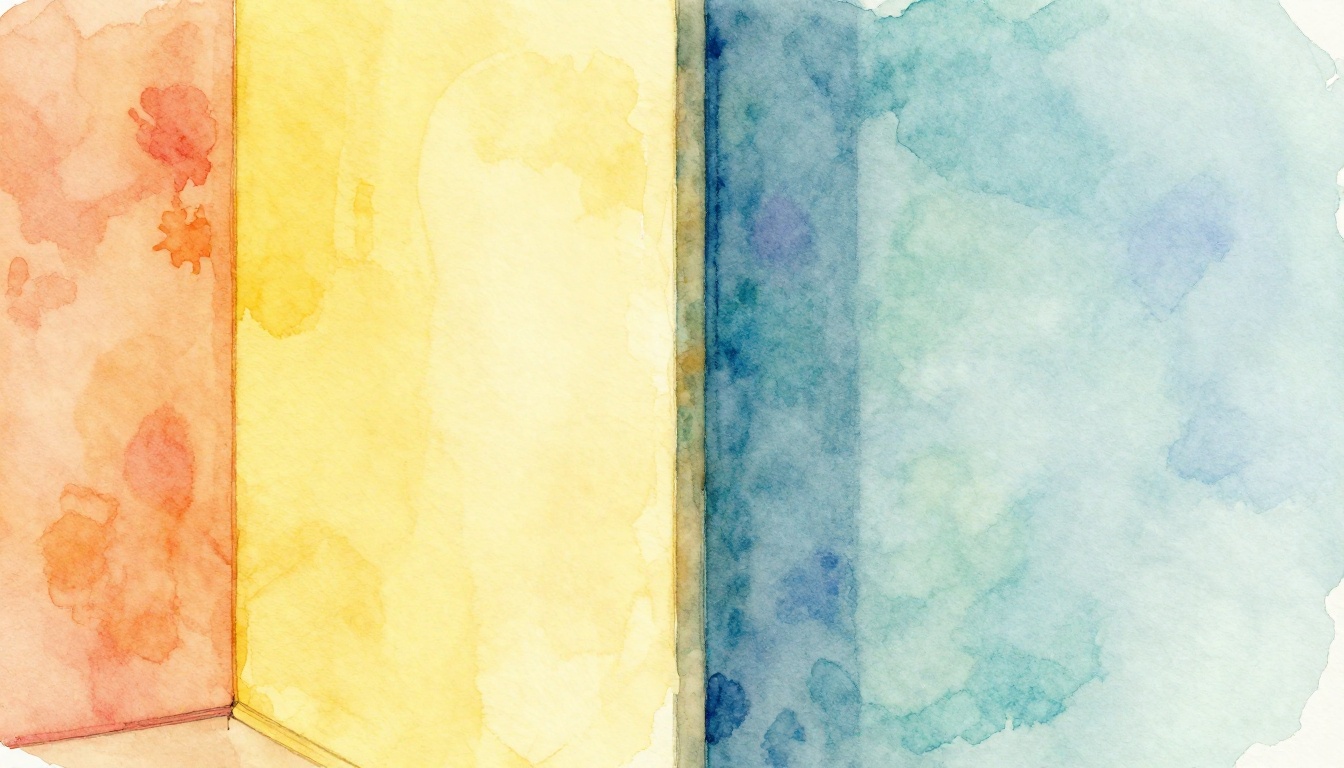
Warm colors draw from fire, sunsets, and fall leaves. Think reds, oranges, yellows. They energize and pull your eye forward. Cool colors mimic oceans, skies, forests. Blues, greens, purples dominate. They soothe and push back visually.
You see these tones everywhere. They guide home decor, outfits, even logos. Understanding them helps you pick paints that fit your vibe or clothes that flatter your skin. We’ll break down the color wheel basics. You’ll learn to spot them fast. By the end, you can mix them like a pro for better results.
Spot the Warm Colors That Bring Energy to Any Space
Warm colors grab attention first. They come from the sun’s glow and campfire flames. Reds, oranges, yellows lead the pack. These hues sit on the color wheel’s right side. They advance toward you. That’s why a red shirt pops in photos.
People feel lively around them. Excitement builds. Hunger stirs too. Kitchens love warm tones for that reason. Gyms use them to pump energy. Social spots thrive on this buzz.
Here are common examples:
- Fiery red (#FF0000): Bold and passionate.
- Sunset orange (#FF4500): Playful and appetizing.
- Sunny yellow (#FFFF00): Cheerful and uplifting.
- Pumpkin (#FF7518): Cozy for fall vibes.
- Coral (#FF7F50): Soft yet vibrant.
- Gold (#FFD700): Luxe and welcoming.
Test them yourself. Hold a warm scarf to your face in natural light. Does it warm your features? That’s a clue.
Everyday Examples of Warm Colors in Action
Red apples tempt you at the store. Their shine screams fresh and sweet. Orange traffic cones demand you slow down. They cut through fog or dusk. Yellow sunflowers lift a dull vase into joy.
These choices tie to feelings. Comfort wraps around a warm-toned blanket. Urgency hits with a sale sign in orange. Start simple. Grab fabric samples. Drape them over furniture. Watch how they shift the mood. Your eye locks on them fast.
Why Warm Colors Make Rooms Feel Cozier and Busier
Warm hues create optical tricks. They leap forward on walls. A tiny room looks packed and snug. Energy rises as a result. Appetites grow, perfect for dining areas.
Psychology backs this up. Warm tones raise heart rates a bit. They spark chats in living rooms. However, overdo them and chaos follows. Balance matters. Small spaces gain hug without clutter. Coziness wins.
Unlock the Calming Power of Cool Colors
Cool colors whisper peace. Blues echo the sea. Greens match deep woods. Purples hint at twilight fields. Find them on the color wheel’s left arc. They recede from view. Calm settles in.
Focus sharpens around them. Stress fades. Bedrooms suit blues best. Offices pick greens for steady work. They expand spaces visually.
Key picks include:
- Ocean blue (#0077BE): Fresh and serene.
- Forest green (#228B22): Grounded and natural.
- Lavender purple (#E6E6FA): Gentle and dreamy.
- Mint green (#98FB98): Light and refreshing.
- Navy blue (#000080): Deep and reliable.
- Periwinkle (#CCCCFF): Subtle and cool.
Play a game. Close your eyes. Picture each one. Feel the temperature drop? That’s their magic.
Common Cool Colors You’ll See Everywhere
Sky blue paints endless calm on a clear day. Mint green graces tea boxes for refreshment. Violet flowers nod in gardens, soft and mysterious.
Nature packs them in. Blue jeans endure daily wear. Green packaging signals health. Imagine chill air with each. Test it. Layer cool fabrics. Notice how skin looks rested.
How Cool Colors Help You Relax and Focus Better
Cool tones pull back. Walls seem farther apart. Cramped rooms breathe easier. Sleep improves in blue bedrooms. Work flows in green offices.
Moods steady out. Stress drops because calm dominates. Common sense shows hospitals pick pale blues. They ease patients. You gain space and serenity. Focus lasts longer too.
Warm vs. Cool: Key Differences and Smart Ways to Mix Them
Spot differences fast. Warm energizes. Cool relaxes. One advances. The other retreats. Best uses vary by need.
Check this quick comparison:
| Aspect | Warm Colors | Cool Colors |
|---|---|---|
| Visual Effect | Advance forward | Recede backward |
| Mood Induced | Energy, excitement | Calm, focus |
| Best Rooms | Kitchens, living areas | Bedrooms, offices |
| Examples | Red, orange, yellow | Blue, green, purple |
Warm suits action zones. Cool fits rest spots. Mix them for harmony.
Psychology explains more. Warm raises pulse slightly. Cool lowers it. Restaurants glow orange for longer stays. Hospitals stay blue for peace.
Balance creates flow. Use warm accents in cool bases. A blue room with orange pillows pops. Illusions play tricks. Warm makes objects bigger. Cool slims them down.
Choose warm for buzz. Pick cool for quiet. Your goals decide.
The Emotional Impact: What Science Says About Color Temperature
Warm stimulates senses. Heart rates tick up. Conversations flow. Cool counters that. Pulses slow. Minds clear.
Real life proves it. Fast-food spots blast yellow. Diners linger. Therapy rooms go green. Patients unwind. Notice it next time you shop or sleep. Colors steer feelings daily.
Pro Tips for Balancing Warm and Cool in Your Designs
Follow the 60-30-10 rule. Let cool cover 60% of space. Warm takes 30%. Neutrals fill 10%. Analogous pairs work too. Blues next to greens stay cool.
Try a blue wall with orange lamps. Harmony hits. Avoid overload. Too much warm tires eyes. Excess cool chills moods. Beginners grab paint swatches. Build a mood board. Apps make it free and fun.
Hands-On Tips to Start Using Warm and Cool Colors Today
Jump in now. Start with your closet. Warm jewelry suits warm skin tones. It adds glow. Cool pieces flatter cool undertones. They sharpen features.
Refresh a room easy. Paint walls cool. Add warm rugs. Digital tweaks count too. Set phone wallpaper to sunset orange. Energy boosts.
Tools help. Free color wheels online spin basics. Apps suggest matches. Watch pitfalls. Too much warm overwhelms. All cool drags down.
Follow these steps:
- Assess your space. Note current mood.
- Pick dominant tone. Warm for lively, cool for calm.
- Add accents opposite. One pillow starts it.
- Test in light. Day and night differ.
- Adjust based on feel. Tweak till right.
Action beats theory.
Quick Home Makeover Ideas with Color Temperature
Bedrooms love cool walls. Pair with warm bedding for cozy nests. Kitchens get warm cabinets. Cool backsplash balances.
Budget wins big. Swap pillows first. Hang warm art on cool paint. Living rooms mix blue sofas, yellow throws. Change hits fast. Mood shifts follow.
Putting It All Together
Warm colors energize like sunlight. They fill spaces with life and draw eyes in. Cool colors calm like a breeze. They open rooms and ease minds. Mixing them smartly creates balance you crave.
You hold the power now. Pick one room or outfit. Test a swap today. Watch the difference unfold. Colors shape your world more than you think.
Ready to see them everywhere? Share your first experiment in the comments. Subscribe for more simple guides on decor and style.
(Word count: 1487)