Picture this: you’re deep into a landscape painting, shadows falling just right across the hills. You grab black paint to mix a gray, but the result looks flat and lifeless, sucking the energy out of your whole canvas. That frustration hits every artist at some point.
Black paint seems like a shortcut for neutral gray, yet it often adds an unwanted cool tone or muddiness. Shadows end up dead and dull because black absorbs light unevenly. Your vibrant scene turns blah in seconds.
Here’s the good news. You can mix a perfect neutral gray without black using just primaries: magenta, cyan, and yellow. These create a true gray full of life and depth, one that reflects light naturally.
Color theory backs this up. Primaries balance each other perfectly, so you avoid the bias black brings. The result stays neutral across all lighting conditions.
In this post, you’ll get a simple step-by-step guide to nail the mix every time. We’ll cover basic color theory you need to know, plus pro tips for home use. No fancy tools required.
Best part? Start with one solid gray base, then tweak it for endless tones: warmer, cooler, lighter, or darker. Your artwork stays alive and breathing.
Ready to ditch black forever? Let’s jump into the exact ratios and techniques that make it work.
Why Black Falls Short for Creating True Neutral Grays
Many artists reach for black paint first when they need gray. It feels quick and easy. However, black often ruins the neutrality you want. It introduces biases that make shadows look off. In contrast, mixing from primaries keeps everything balanced and alive. Let’s break down the key problems and see why ditching black opens better options.
Common Problems with Black-Based Grays
Black pigments carry hidden flaws. They stem from manufacturing or natural sources, so purity varies. This leads to several issues that plague your mixes.
Consider these common pitfalls:
- Muddiness from impurities: Most blacks contain traces of other colors. For example, in a landscape, your forest shadows turn greenish-brown instead of clean gray. The mix absorbs light wrong and dulls the scene.
- Bias toward blue-violet tint: Black cools everything unnaturally. Portrait skin tones in shadow look sickly purple. It overpowers warm highlights nearby.
- Hard to lighten without chalkiness: Add white, and the gray gets pasty fast. Think of a cloudy sky; it lacks depth and feels flat on canvas.
- Clashes with warm lights: Black fights golden hour glows. Your sunset landscape loses harmony because shadows repel the warmth.
- Reduces chroma control: You lose vibrancy range. Shadows die out, like dead shadows in portraits where eyes sink lifelessly.
Test it yourself. Mix equal black and white on a palette. Then try primaries for custom gray. Hold them to light. The black version looks dead; the custom one glows with subtle life. Black acts like salt dumped in every dish. It overpowers and muddies the flavor.
Unlock Endless Tones with Black-Free Mixing
Skip black, and you gain full control. Primaries let you build grays from light mist to deep charcoal. Temperature stays in your hands, so warm or cool fits any mood. These mixes blend smooth into other colors. Plus, they save money over time since you use paints you already own.
Pro artists love this for realism. Richard Schmid avoided black entirely; his figures breathe with natural depth. Similarly, landscape painters like Clyde Aspevig mix custom grays to match shifting light.
Here are the standout benefits:
- Full spectrum control: Hit any value without mud. Light grays stay crisp; dark ones hold punch.
- Temperature tweaks: Warm grays for sunlit rocks, cool for misty mornings. Harmony flows across your palette.
- Seamless blending: No harsh edges. Shadows integrate perfectly, boosting realism.
- Infinite adjustments: Tweak on the fly. Your artwork adapts to any change.
- Long-term savings: No wasted black tubes. Primaries multitask better.
Custom mixes stay vibrant at every tone. Black limits you; primaries expand your range. Your paintings gain that pro-level pop.
Color Basics: How to Build Neutral Grays from Scratch
You can create stunning neutral grays right from the start if you grasp a few color basics. Forget complicated terms. Think of colors like mixing hot and cold water until you hit the perfect temperature. Balance primaries, and you get gray without any color pull. This section breaks it down simply, so your mixes stay true every time. We’ll look at what neutral really means, then how opposites cancel each other out.
What Makes a Gray Truly Neutral
A truly neutral gray has no dominant color bias. It sits at zero hue, where red, green, and blue light reflect back equally. In paints, this happens when you balance colors so none pushes warm or cool.
The Munsell neutral scale sets the standard. Grays there match perfectly, with no tint sneaking in. Test yours by squinting at a reference gray, like a black-and-white photo. If your mix vanishes against it, you nailed neutrality. However, most quick mixes fail this check.
Watch out for common tints. Greenish grays creep in from yellow-heavy blacks or cool blues. They make shadows feel swampy in landscapes. Purplish tints, on the other hand, come from violet-leaning mixes. Skin tones look bruised as a result. Both kill harmony.
Pure neutral gray acts invisible. It supports your painting without stealing focus. Squint test it often. Your eyes spot bias fast. In short, aim for that balanced reflection, and your shadows breathe life.
Power of Complementary Colors in Gray Making
Complementary colors sit opposite on the color wheel. Picture a circle: blues face oranges, reds face greens. They neutralize each other because each blocks the other’s light in paints.
Start with pairs for quick grays. Mix blue and orange first. Blue subtracts orange warmth; orange cuts blue coolness. You get a solid mid-gray. Similarly, red and green cancel perfectly. Green mutes red fire, so the result stays even.
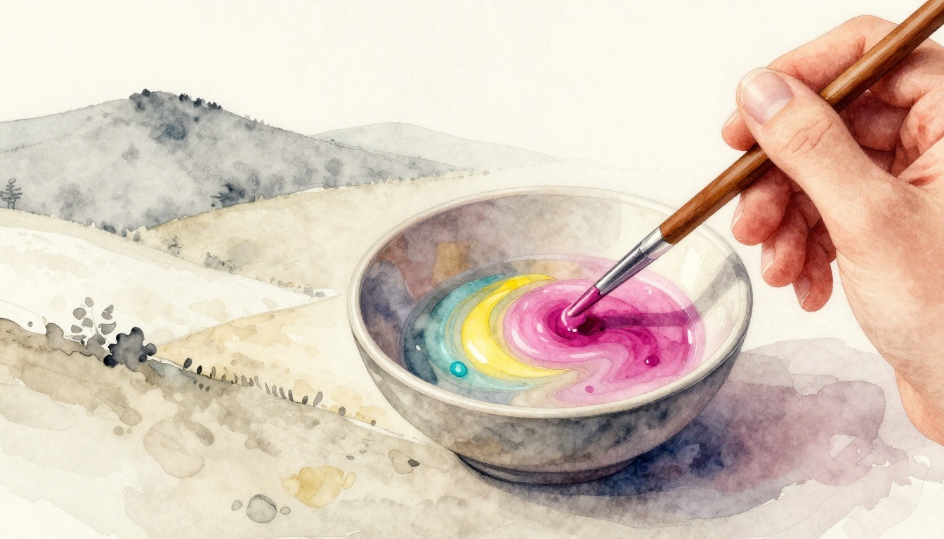
However, pairs often leave a slight bias. Blue-orange might lean warm; red-green could go dull. For the purest gray, use a three-way primary mix. Blend cyan, magenta, and yellow in equal parts. Cyan (blue-green) blocks red; magenta (red-violet) stops green; yellow absorbs blue. They desaturate fully in subtractive mixing.
This trio shines because paints work by subtraction. Each primary soaks up its opposite, leaving neutral. It’s like three friends balancing a seesaw, not just two wobbling. Your gray holds value across lights.
Try it on your palette. Equal drops of cyan, magenta, yellow yield clean gray. Adjust ratios for tone, but keep balance. Complements give power; primaries deliver perfection. Your artwork gains depth as a result.
Step-by-Step Guide to Mixing Your Perfect Neutral Gray
You have the color basics down. Now grab your palette and paints. This guide walks you through mixing neutral gray like a simple recipe. Start small to avoid waste. Use equal parts of your primaries first. Adjust by eye until it looks perfect. Check often under good light. Your result stays clean and bias-free every time.
Pick Your Primary Colors for Best Results
Choose paints that mix clean and stay transparent. Opaque ones muddle fast because they block light unevenly. Transparent pigments layer better. They let colors cancel without residue. As a result, your gray holds true neutrality.
Go for these accessible options in acrylics, oils, or watercolors:
- Quinacridone magenta (or cadmium red light, alizarin crimson): Brings strong red-violet punch. Budget pick for students.
- Phthalo turquoise or cyan (or ultramarine blue, phthalo blue): Cool blue-green base. Cuts warmth precisely.
- Hansa yellow (or cadmium yellow light): Bright, clean yellow. Avoids greenish tints.
Brands like Winsor & Newton or Golden work great. Generic student lines do fine too. They cost less but perform well. For example, pick up tubes under $10 each at art stores. Test a swatch first. Transparent labels help spot them.
Why these? They balance subtractive mixing perfectly. Magenta fights yellow’s warmth; cyan blocks magenta’s red; yellow mutes cyan’s blue. Opaque cadmiums work in a pinch. However, transparents give pro results. Your mixes glow instead of dulling.
Stock these three. They serve double duty for other colors too. No need for black anymore.
Mix, Test, and Tweak Until Neutral
Ready to mix? Work on a white palette for true color view. Use north-facing light if possible. It shows biases clearly without warm distortion. Clean your knife or brush between steps. Fresh tools prevent contamination.
Follow these numbered steps for a mid-tone neutral gray:
- Squeeze equal dollops. Start with pea-sized amounts of magenta, cyan, and yellow. Place them in a triangle on your palette. Equal parts give 1:1:1 ratio.
- Blend in the center. Use a palette knife. Scrape and fold gently. Mix until smooth. No streaks left.
- Test for neutrality. Compare to a photo gray card or quick white-plus-black mix. Squint or hold to light. Does it match without tint?
- Tweak if biased. See purple? Add tiny yellow bit. Greenish? Dot in magenta. Orange pull? More cyan. Go slow, one drop at a time.
- Lighten last. Once neutral, mix in titanium white. Keep stirring fully. Check again.
Repeat tweaks until it vanishes against your reference. This takes practice but builds skill fast. In watercolors, wet your brush first for smooth blends. Oils need more time to marry. Acrylics dry quick, so work fast.
Safety note: Wipe tools clean right away. Dried paint clogs. Your gray base now sits ready.

Scale Up for Light to Dark Grays
Nailed your master mix? Scale it now. Build a full value family from light tints to deep shades. Save the neutral base in a small jar. Dilute later as needed. This pro trick keeps consistency.
Here’s how to expand:
Start with your base gray. Then adjust in stages.
- Light tints: Add white gradually. One part gray to two parts white for soft fog. More white for near-white mist. Stir well each time.
- Mid-tones: Your base works here. Perfect for overcast skies.
- Dark shades: Add equal primary mix to base. Or use burnt umber trace for depth without bias. Builds charcoal without mud.
- Value scale: Paint swatches from 1 (white) to 10 (black). Label mentally: 3 for light shadows, 7 for deep folds.
Test the scale on scrap canvas. Hold to your reference photo. Matches? Great. Mismatch? Tweak the family.
Keep that master mix sealed. Thin with medium for glazes. Your paintings gain harmony across tones. Shadows live now, full of subtle life. Practice once a week. Soon it feels automatic.
Pro Tips and Fixes for Flawless Grays Every Time
You mixed your base gray, but it still looks off sometimes. Don’t worry. These pro tips fix the usual hiccups and help you adapt across paints. As a result, your grays stay flawless no matter what. Let’s tackle mistakes first, then tweak for your medium.
Handle Common Mixing Mistakes
Overmixing kills vibrancy fast. You stir too long, and air bubbles dull the mix. Instead, fold gently with a knife. Stop when smooth. Your gray keeps life.
Bad light tricks your eye too. Warm bulbs add yellow tint. So use north-facing window light or daylight LED. Test there, and biases vanish.
Old paint shifts hue because pigments separate. Check squeeze dates. Fresh tubes mix true. If yours aged, remix small batch and compare.
Here come quick fixes with examples:
- Too green? Yellow overpowered. Add a magenta drop. In landscapes, swampy shadows turn crisp.
- Purple pull? More cyan fixes it. Portrait skin warms up right away.
- Surface fools you. Palette wood warms grays. Switch to white glass. It shows true neutrality.
- Dries uneven? Acrylics grab fast. Mix wet palette style; spritz water often.
Ever squint at your mix next to a photo? If it blends in, you win. These tweaks save hours. Practice once, and mistakes drop.
Adapt for Acrylics, Oils, or Watercolors
Same primaries work everywhere. However, mediums need tweaks. You adjust ratios or tools for best flow.
Start with acrylics. They dry quick, so mix fast. Add water drop-by-drop for flow. Your gray glides smooth on canvas.
Oils take patience. They stay wet longer. Mix in linseed oil or retarder to slow dry. As a result, blends stay workable. No skinning over.
Watercolors shine wet. Use more water upfront. Brush primaries into puddle. Tilt for even spread. Fog effects glow soft.
Store airtight always. Palette seal or tube back in. It keeps grays ready next day.
Experiment more? Try raw umber plus ultramarine as alt. It gives earthy depth without full primaries. Great for underpainting rocks.
Picture fog rolling in. Your custom gray builds it layer by layer. Or underpaint portraits for natural base.
Quick FAQ:
What if my gray shifts dry? Remix fresh each session.
Earth tones better? Use sparingly; primaries rule neutral.
Store how? Fridge for oils, airtight jar for all.
These steps make grays foolproof. Your art levels up fast.
Conclusion
You started with frustration from black paint’s flat, muddy grays. Now you know primaries fix that. Mix equal parts magenta, cyan, and yellow for a neutral gray full of life and depth.
This method gives control over tones and temperatures. As a result, your shadows blend seamlessly. Paintings gain natural vibrancy because biases vanish.
Grab your palette today and test the mix. Share your results in the comments below. Subscribe for more tips on lively colors.
Your paintings deserve grays that breathe life.