Skip to content

loriaa

  • Home
  • About Us
  • DMCA
    • California Consumer Privacy Act (CCPA)
  • Cookie Privacy Policy
    • Privacy Policy
  • Terms of Use
  • Contact Us

admin

How to Mix Realistic Skin Tones with a Limited Palette

April 3, 2026 by admin

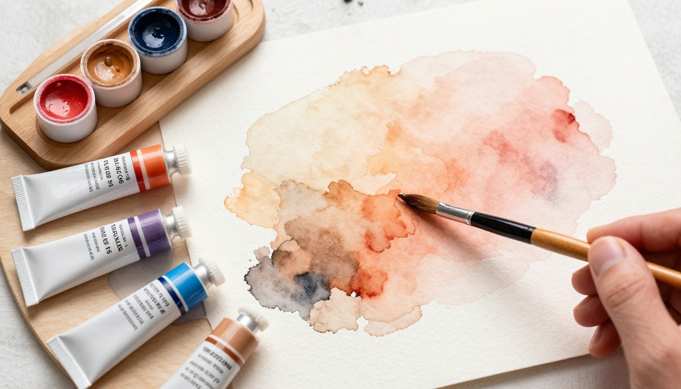
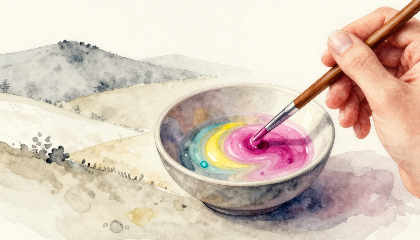
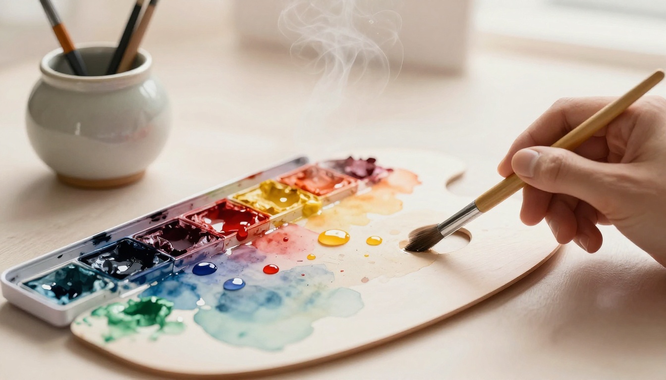
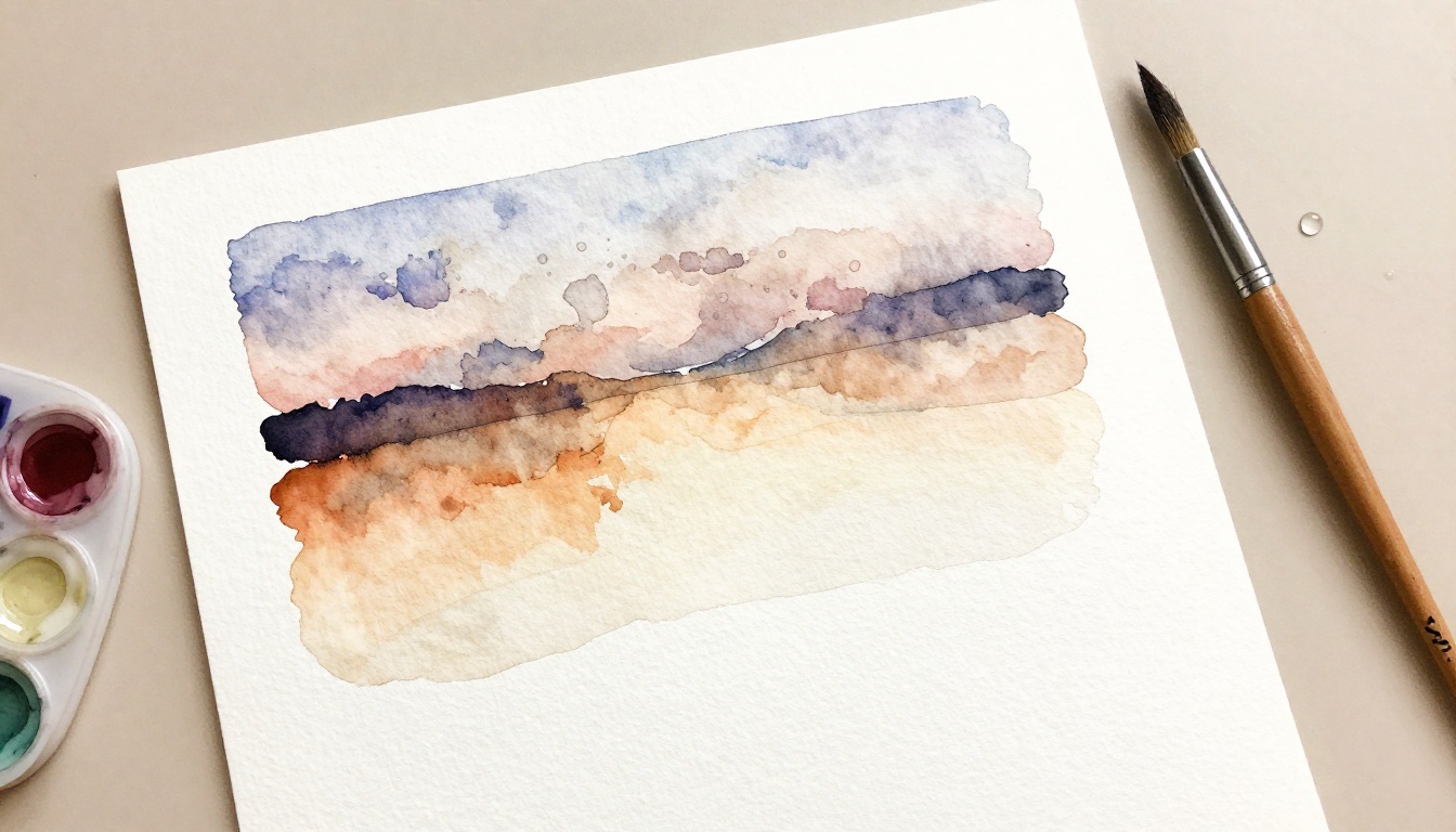
You mix a batch of skin tone paint. It looks perfect wet. Then it dries flat and fake. Real skin glows with warmth, cool shadows, and subtle shifts. Jars labeled “flesh” rarely match anyone. They miss the yellows, reds, and blues in every tone. A limited palette changes that. You use just five or six … Read more

Categories Color Theory and Mixing Leave a comment

How to Create Muted Tones to Avoid Overly Bright Paintings

April 3, 2026 by admin

Picture this. You squeeze fresh paints onto your palette, mix a vibrant sky blue with sunny yellow, and step back. Instead of a serene landscape, you get a neon explosion that hurts the eyes. Overly bright paintings often look flat or cartoonish. They lack depth and mood. Muted tones fix that. They dull colors just … Read more

Categories Color Theory and Mixing Leave a comment

Mix Perfect Neutral Gray Without Black Paint

April 3, 2026 by admin

Picture this: you’re deep into a landscape painting, shadows falling just right across the hills. You grab black paint to mix a gray, but the result looks flat and lifeless, sucking the energy out of your whole canvas. That frustration hits every artist at some point. Black paint seems like a shortcut for neutral gray, … Read more

Categories Color Theory and Mixing Leave a comment

Warm vs. Cool Colors: A Beginner’s Guide

April 3, 2026 by admin

Imagine painting your living room walls a sunny yellow. Suddenly, the space feels brighter and more inviting. You smile more often in there. Now picture switching to a soft blue. The room calms down right away. Colors shape our mood without us noticing. Warm colors draw from fire, sunsets, and fall leaves. Think reds, oranges, … Read more

Categories Color Theory and Mixing Leave a comment

How to Use Complementary Colors for Bold Visual Contrast

April 3, 2026 by admin

Imagine a sunset where fiery orange skies meet deep blue horizons. That clash grabs your eyes instantly. Complementary colors work the same way. They sit opposite each other on the color wheel and create high visual contrast when placed side by side. You might struggle to make your designs pop. Flat colors fail to hold … Read more

Categories Color Theory and Mixing Leave a comment

Gesso for Beginners: Prime Canvas, Wood, Metal and More

April 3, 2026 by admin

Picture this: you spend hours painting on raw canvas, only to watch colors soak in unevenly or flake off days later. Frustrating, right? That’s where gesso steps in as your simple fix. This thick white primer seals surfaces like canvas, wood, or metal, so paint grabs hold strong. It creates even absorbency and delivers smooth, … Read more

Categories Acrylic Painting Fundamentals Leave a comment

How to Keep Acrylic Paints Wet on the Palette Longer

April 3, 2026 by admin

Picture this. You squeeze out vibrant acrylic colors onto your palette, ready for a long painting session. But in minutes, they skin over and crack. That rush to blend before they dry kills your flow. Acrylics dry fast because water evaporates quickly from the paint when air hits it. Unlike oils that stay workable for … Read more

Categories Acrylic Painting Fundamentals Leave a comment

How to Layer Acrylic Paint Without Lifting the Bottom Coat

April 3, 2026 by admin

Ever grabbed your brush for a second coat of acrylic paint, only to watch it rip up the layer below? It happens to beginners and pros alike. That frustrating lift ruins your flow and forces restarts. Acrylics dry fast, which you love, but it also means they stay sticky underneath. Fresh paint re-wets the base … Read more

Categories Acrylic Painting Fundamentals Leave a comment

Create Thick Impasto Textures with a Palette Knife

April 3, 2026 by admin

Imagine a painting where ridges of paint twist and rise like frozen waves, catching light in dramatic bursts. That effect comes from impasto, a technique that piles on thick paint for bold, three-dimensional textures. You get more control and wilder marks with a palette knife than any brush. Brushes often flop under heavy loads. They … Read more

Categories Acrylic Painting Fundamentals Leave a comment

How to Thin Acrylic Paint for Transparent Glazing Effects

April 3, 2026 by admin

You’ve slathered on thick acrylic paint, only to miss the smooth flow and glow you love from oils. It dries too fast and stays opaque, blocking that luminous depth artists chase. But glazing changes everything. You thin acrylic paint just right to build transparent glazing effects. These sheer layers let light shine through, blending colors … Read more

Categories Acrylic Painting Fundamentals Leave a comment
Older posts
Page1 Page2 Page3 Next →

Recent Posts

  • How to Mix Realistic Skin Tones with a Limited Palette
  • How to Create Muted Tones to Avoid Overly Bright Paintings
  • Mix Perfect Neutral Gray Without Black Paint
  • Warm vs. Cool Colors: A Beginner’s Guide
  • How to Use Complementary Colors for Bold Visual Contrast

Recent Comments

No comments to show.
  • Acrylic Painting Fundamentals
  • Brushwork and Application
  • Color Theory and Mixing
  • Composition and Sketching
  • Surface Preparation and Protection
  • Watercolor Methods and Control
© 2026 loriaa • Built with GeneratePress