Ever stared at your watercolor painting in frustration? The sky turns muddy brown instead of soft blue. Or your flower blooms into a watery mess. Beginners face this all the time because they skip one key step: controlling the water-to-paint ratio.
This ratio means the balance of water and pigment in your mix. It decides if your colors stay vibrant or fade away. Get it right, and you create smooth washes for sunsets or bold strokes for leaves. Your results become predictable. No more guesswork.
Mastering ratios works for watercolor and water-thinned acrylics. It unlocks control over flow, strength, and drying. In this guide, we cover the basics, tools you need, mixing steps, fixes for errors, and practice tips. You’ll see why small changes make big differences. So grab some paper and paints now. Let’s mix your first perfect wash.
Why Water-to-Paint Ratios Make or Break Your Paintings
Ratios control everything in your painting. More water dilutes the pigment. Colors lighten and spread far. Less water keeps pigment strong. It stays in place with crisp edges.
Think of it like juice. Add lots of water, and you get pale flavor. Use less, and it tastes bold. Paint acts the same way. A high ratio creates transparent layers for distant hills. A low one builds rich shadows on fruit.
Drying time changes too. Wet mixes take longer to set. They give soft blends. Dry mixes grab fast. Edges sharpen. Beginners often guess amounts. They end up with uneven tones or hard lines. Measure instead. Results stay consistent.
Here’s a simple table of starting ratios. Use it as a reference.
| Ratio (Water:Paint) | Use Case | Effect |
|---|---|---|
| 1:1 | Medium wash | Balanced color, good flow |
| 3:1 | Light sky | Sheer transparency |
| 10:1 | Glaze | Barely tinted layer |
This setup prevents muddy builds. You layer without losing clarity.
Spotting the Impact on Your Artwork
Look at bad ratios first. Too much water causes blooms. Paint pools and spreads wild. Your clean sky edge turns fuzzy. Too little water leaves chalky spots. Colors dry harsh and flat.
Good ratios fix that. A tested mix gives even coverage. No surprises. Picture a landscape. Heavy foreground needs 1:1 for depth. Sky wash at 5:1 flows smooth. Edges stay soft where you want.
Watch pro work online. Notice how skies fade naturally. Granulation adds texture in rocks. Backruns create happy accidents. Test these on scrap paper. Your eye learns fast.
Ratios for Different Paint Types
Watercolor from tubes needs more water. Pans release pigment slow. Start at 2:1 for flow. Acrylics thinned with water act similar. But use less. Ratios over 5:1 crack as they dry.
Tubes give fresh pigment. Mix 3:1 for most washes. Pans suit quick sketches. 4:1 works best. Acrylics stay flexible at 2:1. They dry matte. Adjust based on brand. Test small batches first.
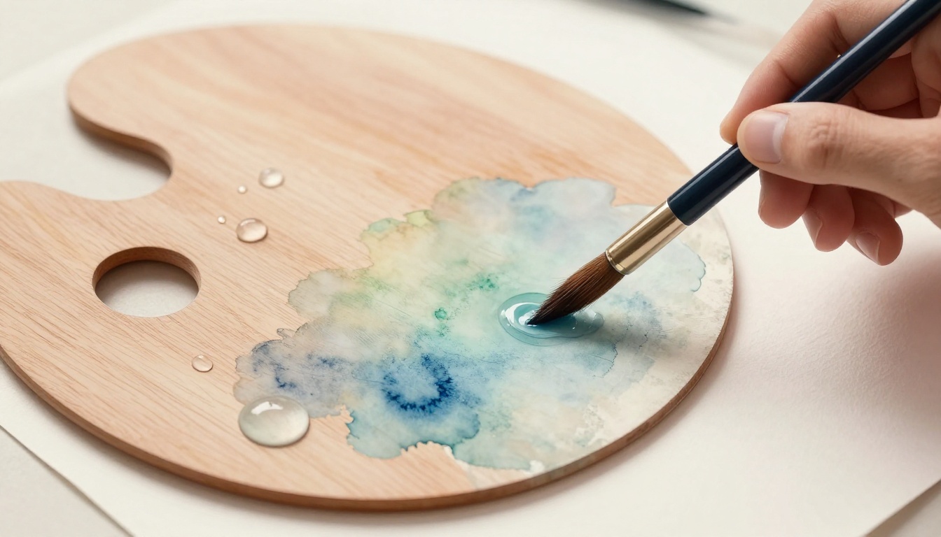
Essential Tools for Measuring Ratios Without Guesswork
You don’t need fancy gear. Start simple. An eyedropper measures water drops exact. A mixing palette holds puddles clean. Use a round brush to stir smooth.
Plastic cups from the kitchen work fine. They show levels clear. Measuring spoons scoop paint even. Scrap paper tests without waste. Clean tools each time. Rinse in water. Wipe dry. Colors stay pure.
These basics give pro control. Spend under ten dollars. Or use what sits home. Results match high-end studios.

Budget Options You Already Own
Teaspoons scoop paint blobs. They’re precise enough. Pipettes from old medicine bottles drop water spot on. Free and ready.
Pros include no cost. You learn ratios quick. Cons mean less control than droppers. Still great for starters. Practice builds skill.
Step-by-Step Mixing Guide for Foolproof Ratios
Pick your color first. Squeeze a pea-size blob on palette. Add water next. Start with a big puddle.
Follow these steps every time.
- Pour water first. Aim for your target ratio, like 3 parts water.
- Drop paint in slow. One drop at a time. Stir with brush tip.
- Mix until even. No streaks left.
- Test on scrap. Wait a minute. Check dry color.
- Adjust if needed. Add paint for strength. More water to lighten.
For heavy color, go 1:1. Medium washes hit 3:1. Light skies need 10:1. Wet-into-wet uses extra water. It blends on damp paper. Dry brush keeps ratios tight for texture.
Pigment settles fast. Stir often. Clean brushes between colors. Dip in clean water. Wipe on rag. Safety keeps mixes pure.
Try leaves. Base green at 2:1. Shadows darker at 1:2. Skies start 5:1. Tilt paper for flow.
Testing Your Mix Before the Paper
Paint a streak on scrap. Let it dry one minute. Intensity shows true color. Too pale? Add paint. Too dark? Thin more.
Note your wins. Build a cheatsheet. “Ultramarine blue: 4:1 for sky.” Tests save full sheets from waste.
Adapting Ratios for Wet-on-Wet Magic
Wet paper light first. Use spray bottle. More water in mix, like 6:1. Layers blend soft. Time it right. Add wet paint quick. Watch edges bloom natural.
Fixing Common Ratio Mistakes on the Fly
Errors happen. Watery mix blooms big. Blot with paper towel. Absorb excess fast. Chalky paint needs water. Spritz light.
Uneven tone? Layer glazes dry. Build slow. Consistent mixing prevents most issues. Stir well upfront.
One painting saved a whole sky. Too wet at start. I blotted, added strong color dry. It worked perfect. Mistakes teach best. You gain speed.
Rescuing Overly Diluted Washes
Blot puddles right away. Let dry full. Layer bolder mix on top. Dry brush for control. Patience wins.
Saving Thick, Stubborn Paint
Mist water from brush tip. Work it in quick. Before crust forms. Restir constant.
Pull It All Together for Confident Painting
Ratios give you power. Understand effects first. Grab simple tools. Mix, test, adjust. Fix slips fast.
Practice ten minutes daily on scraps. Soon, washes flow effortless. Your dream paintings come alive.
Share your first ratio test in comments. What color surprised you? Subscribe for brush guides next. Paint bold today.