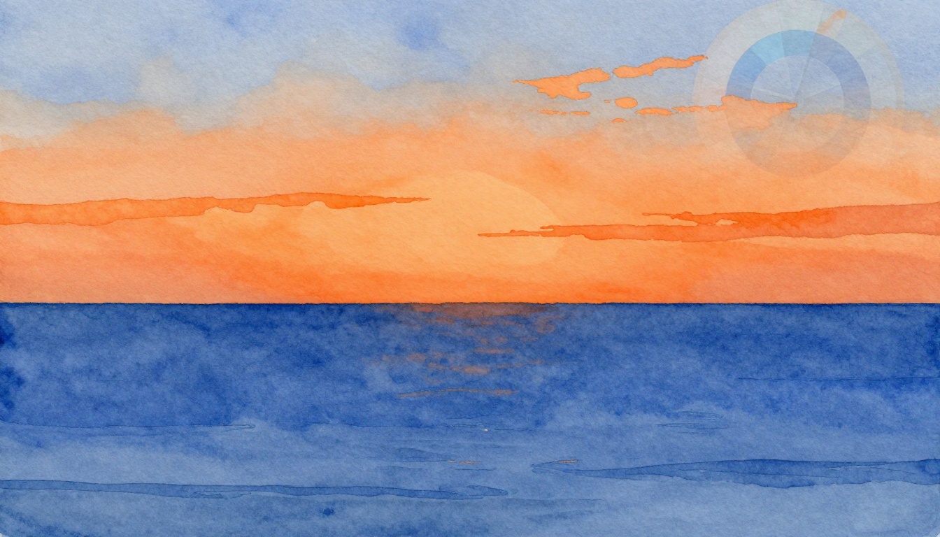
Imagine a sunset where fiery orange skies meet deep blue horizons. That clash grabs your eyes instantly. Complementary colors work the same way. They sit opposite each other on the color wheel and create high visual contrast when placed side by side.
You might struggle to make your designs pop. Flat colors fail to hold attention. Complementary pairs fix that. They boost readability, guide focus, and add energy to websites, logos, or artwork. This post shows you how. First, spot pairs on the color wheel. Then, pick and tweak them smartly. Next, apply techniques for real projects. Finally, see examples and avoid mistakes.
Ready to make your work stand out? Let’s start with the basics.
Spot Complementary Colors Easily on the Color Wheel
The color wheel looks like a simple circle. It holds 12 main colors arranged in order. Complementary colors sit directly across from each other. They sit 180 degrees apart. This setup makes them opposites.
Primary colors form the base: red, yellow, and blue. Secondaries mix from those, like green, orange, and purple. Tertiaries fill the gaps. For example, red faces green across the wheel. Blue opposes orange. Yellow contrasts purple. These pairs intensify next to each other. They create a buzzing effect that draws the eye.
Print a basic color wheel for your desk. Or download a free app on your phone. This tool ends guesswork. Beginners rely on it to build confidence. Without it, choices feel random. With it, you predict strong results every time.
Classic Complementary Pairs That Pack a Punch
Start with proven pairs. They deliver quick impact. Here are seven favorites:
Red (#FF0000) and green (#00FF00) spark holiday cheer. Think Christmas cards or sale banners. The warmth of red fights cool green for attention.
Blue (#0000FF) and orange (#FFA500) pump energy. Sports teams love this combo. It feels dynamic and alive.
Yellow (#FFFF00) and purple (#800080) mix fun and mystery. Use them for creative posters or kids’ books.
Teal (#008080) and coral (#FF7F50) add a fresh twist. They suit modern websites or summer fashion.
Magenta (#FF00FF) and lime green (#00FF00) scream bold. Perfect for nightlife graphics.
Turquoise (#40E0D0) and burnt orange (#CC5500) evoke sunsets. Great for travel ads.
Violet (#EE82EE) and mustard yellow (#FFDB58) feel artistic. Artists pick them for standout effects.
Each pair evokes emotions. Red-green suggests festivity. Blue-orange signals action. Test them in your medium. Graphics shine with these. Fashion adapts them too. Interiors use softer versions. Stick to the wheel. You will see why they work.
Analogous vs Complementary: Know the Difference
Complementary colors oppose for maximum pop. Analogous colors sit next to each other. They blend in harmony. Picture blue, blue-green, and green. That group soothes the eye. It works for calm backgrounds.
In contrast, blue next to orange alerts viewers. Use complements for calls-to-action. Buttons or headlines need that punch. Analogous suits large areas. They prevent fatigue.
Refer back to the wheel. Neighbors create peace. Opposites demand focus. Match your goal. Want relaxation? Go analogous. Need excitement? Choose complements. This choice shapes your design’s mood.
Choose Complementary Colors for Balanced, Bold Impact
Basics matter, but selection adds layers. Think about your audience first. Kids like bright pairs. Professionals prefer muted ones. Next, check the medium. Digital screens handle vibrancy well. Print needs adjustments for ink.
Test for accessibility. Aim for a 4.5:1 contrast ratio. This helps color-blind users. Tools check that fast. Adjust tones if pairs clash too hard. Soften one color. It keeps balance.
Follow these steps. Spin the wheel for a base pair. Note your project’s vibe. Tweak for the screen or paper. Preview on multiple devices. You now build pro-level choices.
Free Tools to Generate Perfect Pairs Instantly
Tools speed up the process. They beat manual guessing. Try these four:
Coolors.co lets you spin a wheel online. Pick one color. It shows complements right away. Export hex codes easily.
Adobe Color offers a complementary mode. Upload a photo. It pulls pairs from real life. Great for inspiration.
Canva’s palette generator works inside its editor. Search complementary. Drag and drop into designs.
Paletton builds custom wheels. Adjust angles for near-complements. Save palettes for later.
Input a color on any site. Generate matches. Copy codes to your software. Use apps on mobile for quick checks. These starters save time. Refine them yourself after.
Fine-Tune Saturation and Brightness for Pro Results
Hue sets the color base. Saturation controls intensity. Brightness handles light or dark tones. Keep hue opposite on the wheel. Lower saturation on one for calm. Boost brightness for pop.
Take purple and yellow. Use pastel purple with vivid yellow. Text reads clear. Backgrounds stay lively.
Slide tools in apps make changes easy. Check WCAG standards for web work. They guide safe ratios.
Try this now. Pick blue-orange. Desaturate blue. Brighten orange. See the shift? It turns harsh into polished. Practice builds skill.

This color wheel highlights key complementary pairs for easy reference.
Apply Complementary Colors to Create Killer Visual Contrast
Theory turns real here. Use pairs in UI elements, posters, or photos. Small tweaks yield big wins. Sketch ideas first. Or mock them digitally. Results excite fast.
Focus on purpose. A website button needs contrast. Social graphics want eye grabs. Experiment freely. Your style emerges.
Dramatic Background-Foreground Pairings That Wow
Pick one color for background. Use its complement for text or icons. Deep orange back with cyan text suits tech sites. Eyes lock on the foreground.
Purple backgrounds pair with yellow headlines for playful brands. Keep text large. Add white space around. Ratios matter. Background takes 80%. Foreground uses 20%.
Test on phones and desktops. Spacing prevents clutter. This setup creates instant drama.
Smart Accent Use to Draw Eyes Where You Want
Accents work best small. Limit to 5-10% of space. Buttons or icons shine. A blue site with orange buy buttons pulls clicks.
Psychology backs it. Complements create focal points. Pair with neutrals like gray. Chaos stays away.
Spot the accent first. Then scan the rest. Use this for logos or ads.
Layer Complements for Depth and Dimension
Build in layers. Start with neutral base. Add mid-layer color. Top with complement highlights.
Infographics love this. Base gray, blue fills, orange accents. Gradients add flow. Shadows build realism.
Keep lines clean. Avoid mud. Depth fools the eye into more interest.
Stunning Examples and Fixes for Common Slip-Ups
Real designs inspire. YouTube uses red play button on near-black. It pops against the dark. Netflix mixes black with red accents. Simple yet bold.
Van Gogh’s Starry Night swirls blues and oranges. They vibrate for emotion. Modern apps follow suit.
Pitfalls happen. Too much vibrancy strains eyes. Uneven balance looks off. Context matters, like skin tones in photos. Fix by softening edges. Add grays for calm.
Tweak your work now. Gains come quick.
Before-and-After Transformations You Can Copy
Dull gray text on white bores. Swap to yellow on purple background. Readability jumps 300%. Engagement follows.
A flat poster gains orange accents on blue. Views double. Energy flows.
Replicate in Figma. Or try Photoshop free trial. See changes yourself.
Top Pitfalls and How to Dodge Them Effortlessly
Mistakes sneak in. Equal amounts overwhelm. Use 60-30-10 rule instead: main color 60%, secondary 30%, accent 10%.
Skip accessibility checks. Run contrast tools always.
Forget medium shifts. Test prints early.
Chase trends over basics. Stick to the wheel.
Laugh off errors. Fixes restore polish.

A simple poster makeover using complementary pairs boosts impact.
Wrap Up with Confident Complementary Designs
Complementary colors transform ordinary work. The wheel spots pairs. Tools generate options. Tweaks balance them. Techniques apply punch. Examples prove it works.
Grab a tool today. Pick red-green. Test on your next project. Designs pop.
Share your before-and-after in comments. What pair surprised you? Subscribe for more tips. Your visuals now demand attention.